Reducing cognitive load as a solo builder
One screen in my app had quietly grown three separate jobs and five decisions before a user could do anything useful.
When you're building solo, feature creep slips in. You don't have a research department to test every layout, and you don't have a team to bounce ideas off. It's incredibly easy to get stuck in your own head.
This is the quick, repeatable loop I used to scale back the complexity of my app, Next Gig: count the friction points, set hard limits, run fast variations on the canvas, and pick the best trade-off.
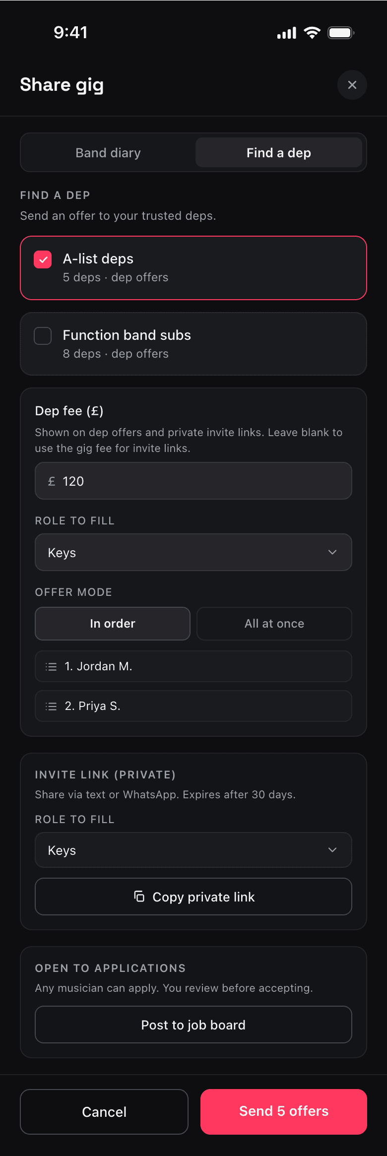
00The screen that got out of hand
Small, reasonable product decisions stack up fast. Before you know it, a single view is doing way too much.
That's what happened to my “Find a dep” tab — the screen a band leader uses to fill a last-minute slot when a player drops out. Over a few weeks, I had accumulated three entirely different ways to solve the same problem:
- Send direct offers to a trusted roster.
- Copy a private invite link to send manually.
- Post the gig publicly to a job board.
I had three completion paths fighting for attention on a single screen, with zero visual hierarchy to guide the user.
01Looking at the maths, not the vibe
It started with a nagging feeling that something wasn't right. To get out of my own head, I ran my UX walkthrough skill — a persona-based review I use to audit existing journeys or test new ones through the eyes of real users.
Instead of trusting a vague “this feels busy” vibe, it gave me the exact numbers driving the friction:
- 5 decisions required before making any progress (tab → roster → fee → role → offer mode).
- 3 separate paths competing for attention with equal visual weight.
- 4 distinct concepts on screen at once (dep offers, ordered broadcasting, private links, job boards).
Breaking it down into hard numbers shifts the focus. It's no longer just my opinion; it's an objective look at friction affecting real users — like a time-poor musical director trying to fix a line-up emergency in 20 seconds.
02Giving myself hard limits
Before opening the canvas, I turned those numbers into a tight, measurable brief for myself. I set three strict thresholds for the redesign:
- Decisions before the primary action
≤ 3 1obvious primary path≤ 2new concepts on first render
03Running parallel variations
With the constraints locked in, I used Claude Code alongside my Paper skills to explore the fixes in parallel. I quickly spun up a baseline plus three distinct layout directions on the canvas, all using my real design tokens (Space Grotesk, Inter, and my dark theme):
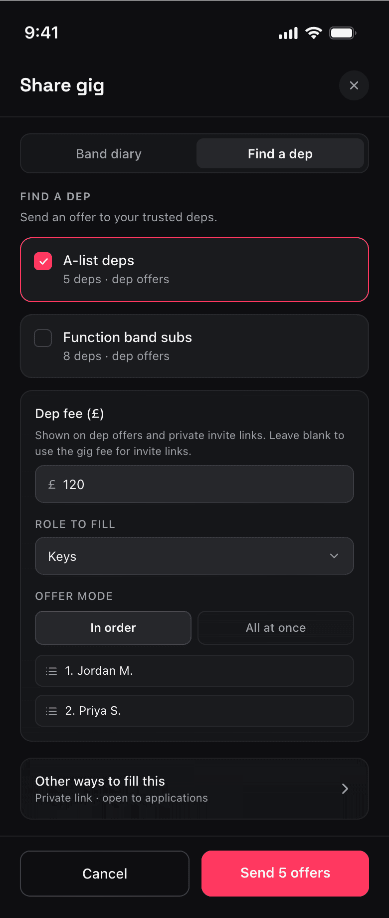
Option A (The disclosure): Keep the primary path dominant, and collapse the other two choices into a quiet “Other ways to fill this slot” section.
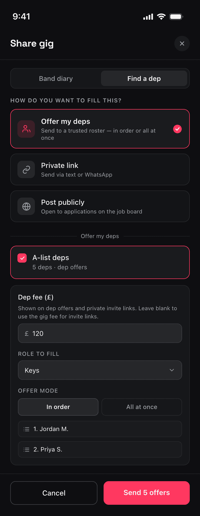
Option B (The routing): Force the user to choose their method first. Only render the fields for that specific choice, keeping competing concepts separate.
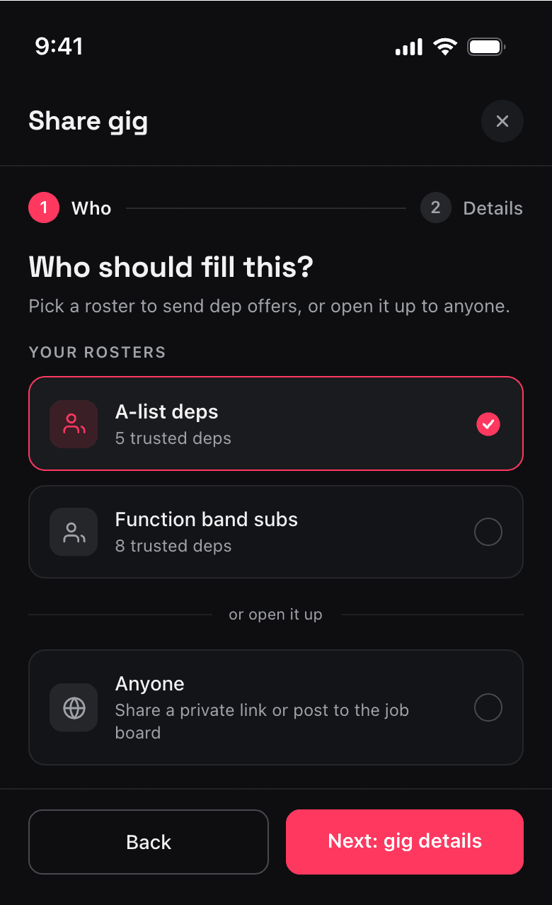
Option C (The wizard): Split it into a clean, two-step flow — who you need first, details second.
04Choosing the trade-off
Every design is a trade-off. Having them side-by-side on the canvas made the choice straightforward:
- Option C was clean, but turning a quick task into a multi-step wizard felt too heavy for a fast workflow. I dropped it.
- Option A was the safest, lowest-effort build. It cleared the thresholds by hiding complexity behind a progressive disclosure.
- Option B tackled the root problem best. It reframes the screen around the user's first logical question rather than my internal feature list.
I chose Option B because it matched the user's mental model best, but kept Option A as my validated fallback if the engineering side got too complex to build quickly.
05The takeaway for solo builders
You don't need a massive research budget to keep your interface clean. You just need a repeatable system to keep yourself honest:
Count the friction. Don’t guess. Count the choices, decisions, and competing concepts.
Design to thresholds. Give yourself hard limits (like “max 3 decisions”) before you sketch anything.
Compare variations in parallel. Review distinct layout directions side-by-side so the product and code trade-offs are immediately obvious.
Both skills from this loop are now yours to try: the UX walkthrough skill and the Paper skills. Download them, run the loop on your own product, and say hello if it helps.